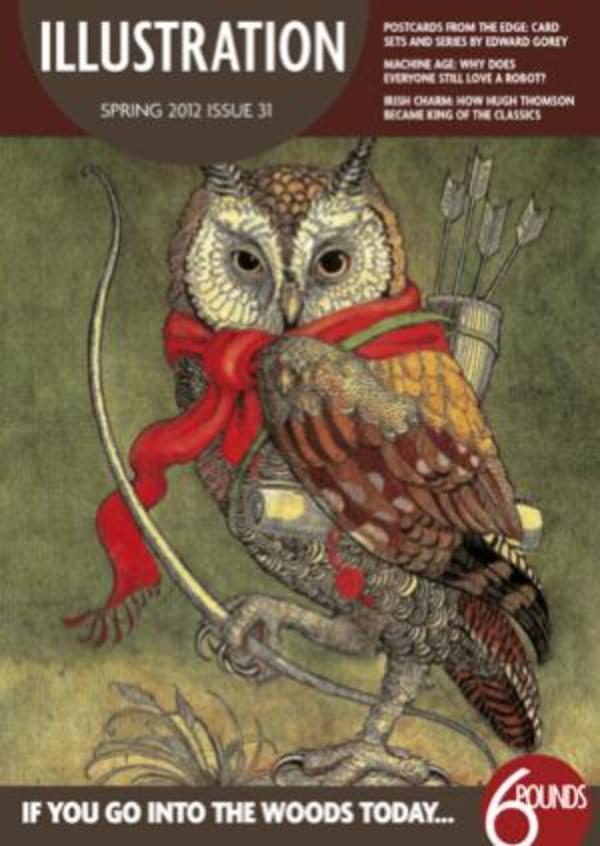
Illustration - Spring 2012 - Issue 31
What makes a classic? It’s a term we use often, but its meaning varies widely. Hugh Thomson made his name illustrating charming editions of 19th-century classic novels, beautifully decorated in gilt and packed with line drawings of key characters and scenes. François Rabelais’ 16th-century tales of Gargantua and Pantagruel, however, have become classics by dint of their enduring popularity, but could hardly be housed on the same shelf as the genteel Cranford series, although they also boast images by many of the greatest illustrators of the past. Meanwhile, much of the work of Edward Gorey was originally self-published and, presumably, popular with a relatively small, select group of fans who appreciated his weird and wonderful imagination - now, however, publishers reissue his work in ever more inventive formats and collectors battle for first editions, making these true modern classics.
These works have nothing in common other than an ability to generate a long-lasting appeal, an elusive attribute that illustrators such as Charles Van Sandwyk hope to emulate. Publishers and critics frequently herald a new volume as a classic, but tracking down a single quality that will lead to it being similarly appreciated in future is impossible. Fashion plays its part, but a true classic transcends fads. Sometimes we recognise things as classics only once we are in danger of losing them, or turn things that were commonplace into treasures once they are no longer current – as Chris McEwan realised when an exhibition featured his collection of robots. Illustrators who aspire to classic status must strive for originality while meeting demand for current trends. However, many also target young audiences and their pictures should become part of the culture of a generation. This is a gift and a responsibility and, at time when more books are going online, we must hope that our children still identify and cherish their own classics in future.

