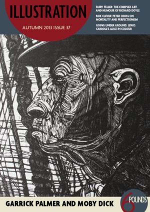
Illustration - Autumn 2013 - Issue 37
One of the most interesting things about mixing images with text is the many different layers of meaning that they can provide and the multiple, sometimes conflicting, messages they can send to different people at different times. One picture rarely says one simple thing. This is precisely why illustrations can add so much to text – the result is greater than the sum of its parts. Richard Doyle, for example, was known as a satirist and humorist as well as for his fairy illustrations, which are far better known today. Satire dates quickly and many readers today will miss the nuances of his humorous works, however his fairy images have violent and strange undertones that, perhaps, modern audiences will notice more than their Victorian counterparts.
Some texts are particularly complex and multi-layered, making the illustrator’s job more challenging. Garrick Palmer, illustrator of both Moby Dick and The Rime of the Ancient Mariner, found the latter so difficult it took him 10 years to complete. Alice in Wonderland is another text that lends itself to interpretations depending on the experiences of reader and illustrator. Tatiana Ianovskaia used her childhood in Soviet-era Tbilisi to inform her versions of Lewis Carroll’s classics and it’s particularly fascinating to compare these with images by Carroll himself, which offer a rare glimpse into an author’s own visual imagination.
And illustrations tell us about contemporary society. Illustrations in early printed books taught their readers about classical warfare, biblical genealogy and natural history. Today, illustrator Sarah Garland’s latest book deals with topical issues around refugees while Peter Cross is planning a three-dimensional “illustration” summing up his past present and future. Such projects are exciting now, but will undoubtedly have other messages for the next generation of readers. This is a great gift to treasure and to pass on.

